With restoration about to begin on 16 historic PCC streetcars for the popular F-Market & Wharves line, Muni has asked Market Street Railway for thoughts on historic paint schemes, or “liveries,” for 3 of the double-ended “torpedo” cars. The final decision belongs to Muni, which of course owns the streetcars about to be restored.
We’re taking a look at the different possibilities being considered, with our first focus on cities that actually ran double-end PCCs at one time. The first post looked at Dallas, Texas (which ran double-ended PCCs from 1945 to 1956) and in this second installment we’re going to look at Boston, Massachusetts (which actually bought Dallas’ PCCs second-hand in 1958-59).

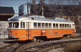
Soon after going into service in Boston, October 1960, showing “MTA” logo. Hal Greenwald photo, Joe Testagrose collection through nycsubway.org
These streetcars, which in Dallas were called the “gliding beauties”, became the “Texas Rangers” in Boston where they ran from 1959 until 1981. At that point, thoroughly worn out, the double-end cars were retired. Several have been preserved by museums, but today their underframes are virtually nothing but rust. During their service for the Boston Metropolitan Transit Agency (replaced in 1964 by the Massachusetts Bay Transportation Agency, MBTA), these streetcars spent most of their time on the short, isolated Mattapan-Ashmont line.
Their first livery conformed to the Boston standard of the late 1950s: orange with cream trim, dark red striping under the windows, and a silver roof, with a small “MTA” logo on the side, with no wording indicating Boston or Massachusetts.

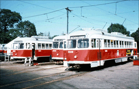
Boston double-end PCCs in red livery, 1970s David Pirmann collection through nycsubway.org
This color scheme is basically what should be on Muni’s single-end PCC No. 1059, honoring earlier Beantown streetcar operator Boston Elevated Railway, but the orange turned out red-orange in Muni’s version and will be corrected when No. 1059 is next fully repainted.
By the 1970s, Boston color-coded its streetcar lines. Most of the ex-Dallas cars, assigned to the Mattapan-Ashmont line were painted bright red, with white trim and gray roofs, symbolizing that isolated streetcar operation as an extension of the Red Line subway.

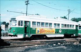
Boston double-end PCC in green livery, 1970s David Pirmann collection through nycsubway.org
Some ex-Dallas cars, which served the other streetcar lines, were painted green with white trim and gray roofs. All carried MBTA’s logo: a black “T” in a white circle. And there may be the rub for those two liveries. It is widely expected that the new double-enders will open Muni’s E-Embarcadero line from the Wharf to Caltrain, the southern portion of which will be shared with Muni’s T-Third Street line. Having a big “T” painted on the side of a PCC may be misleading, to both intending E-line and T-line riders.

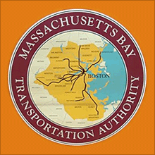
Current logo on a Mattapan-Ashmont PCC. Richard Panse photo.
One other possible option for a Boston livery, though less than wholly authentic: in the early 1950s, before the “Texas Rangers” arrived, and again in recent years, Boston PCCs in the orange and silver livery wore a map-style logo (the picture shows the current version, on today’s rebuilt single-end PCCs serving the Mattapan-Ashmont line).
This large logo on an orange and silver PCC would certainly make it clear which system the car honored, though remember except for the logo, the “Boston Elevated Railway” tribute livery on No. 1059 would be virtually identical once it is repainted into the correct shade of orange.
Whew! So the question is: should one of Muni’s double-end PCCs up for restoration be repainted in a Boston livery, and if so, which one? Comment below, or If you’d prefer to comment privately, you can do so at comments@streetcar.org
Part 1: Dallas, Texas
Part 2: Boston, Massachusetts
Part 3: Pacific Electric
Part 4: San Francisco
Part 5: Something Completely Different
The green one looks a lot like 1015 and 1058 and the red one is similar to the mostly red Dallas livery. Since Boston is already represented, do any of the double-ended PCCs even need a Boston scheme? Or could one get the orange and then could 1059 be repainted to something else entirely down the line?
Regarding the T logo, I don’t think any confusion should be introduced if it’s possible to avoid it. 4th and King is already bad enough without vehicles with a big T stopping at the platforms on King Street.
I like the bright red with white trim and a gray roof!!
Check the photo of the bright red color scheme. It too has a “T” logo on the side of the car. As the Blog writer, and Peter M. stated, it may cause confusion. So maybe, you just forget about it!!
Orange,Cream,and Silver,Definitively….
I like the green, perhaps instead of using the “T” logo, use the map instead, while it might be inaccurate, it could dispell the confussion. Personally, I’d go with the “T” logo, as I believe customers will know that it is a transit logo and not a route designation. Anyone riding a bus/ subway/ streetcar, looks at the front or side by the door for that, and not on the carbody itself. I think that the orange while nice, is already represented, and i think that the red would be good too, but how many vehicles have a red livery already? (same can be said about many colors I know).
Since the orange paint scheme is identical to 1059 (when it is correctly re-painted) and since the red is very similar to the Dallas red, I think another Boston paint job is much less desirable than a Dallas paint job.
I would favor the orange and cream, because it honors not only Boston, but several other electric railways that used orange paint jobs (Johnstown PA comes to mind). I also recommend the “MTA” logo, because that’s the entity that was made famous by the Kingston Trio (who may have even performed it in The City). Second choice would be the red and white–when the “Texas Rangers” were assigned to the Ashmont Mattapan line, I think they were rebuilt as single-enders, rather like what Muni did to the 1006 class in 1955. The red and white color scheme reminds me of the short-lived “Valley Seven” class on Pacific Electric, although the colors aren’t quite the same.
Think about Peter M’s suggestion to do a torpedo in orange and cream and re-paint 1059. Or, since there already is a Boston Car, just skip this idea. The “T” schemes are OK, but nothing to write home about. Maybe MUNI should have saved a 13XX Boeing LRV and painted it for MBTA.
I really like that orange and would be happy to see both a single and a double PCC painted that way because it would improve the odds of seeing one on Market Street. It would be fitting to have multiple Boston trolleys since it is a major American city and one of the few with a well known subway system and I’d bet we get a lot of tourists from New England as well.
As long as 1059 gets the correct orange color (and possibly that map logo, as now appear on the Mattapan-Ashmont cars, I say forego a double-end Boston colored
car, as they look nothing like the Texas Rangers.
If they correct 1059 to Boston’s accurate shade of orange, then I’m for going with the red version of Dallas’ streetcars–since the white and red is too tame, too dull. But, at this point–and again hinging on 1059 getting a more accurate color scheme, I’m for Dallas red. But what of the “Gulf (oil)” color scheme of Boston, that came later, or am I missing something?
Neither Dallas nor Boston paint schemes really stand out, since there are already cars in very similar paint schemes running. There has been some talk on here somewhere about keeping more of the cars in Muni paint. Well, how about going a step further and painting one of the Torpedoes in the “original” (1920s) Market Street Railway paint scheme, dark green sides with the famous white fronts? I think that would look great on a double ended car.
Stay tuned Lee because we have post coming up to discuss San Francisco paint schemes, include the one designed, but never used, by the original Market Street Railway Company.
Coming from Boston, I like the old MTA color scheme with the map logo but a Dallas car in cream would be my second choice as one of the cars at Seashore museum is painted in the early colors — its almost too red!
Frankly, I’d prefer the tangerine and cream if Muni were to do a PCC representing Boston.
Green, please
If the intent is to be historically correct then you should only advocate painting these double ended cars in the liveries of cities that actually operated double ended cars and Boston is one of them. As a lifelong Bostonian I would opine that these cars are best remembered here in their original paint scheme – orange with cream trim and a silver roof. This is the livery they were in when commonly used throughout the system as double ended cars. When in the red or green schemes they were limited to the short Mattapan/Ashmont line where their double ended capabilities were not utilized at all and where their exposure was limited. The decision to use the original paint scheme is further reinforced by the fact that our transit system has gone back to the orange and cream scheme on the remaining PCCs operating in Boston.